REA SOLAR - Elion  | Naming + Branding

Creativity

Rombo si señor

Challenge: 

Build a brand from the ground up for a solar energy investment platform, starting with its name. We want a simple yet unique name that conveys what we do, while also evoking the technological and innovative space we operate in. We’ll be guided by the following points:

  1. One word that conveys simplicity—less is more.
  2. The use of English or other languages is welcome to suggest globalization, but it should be easy to pronounce.
  3. It should reflect the business’ core: solar energy.

Solution

  1. Naming

After conducting a brand co-creation workshop with the client, which involved various creative exercises and an in-depth understanding of the business and its consumers, we gathered different insights and ideas as the foundation for the selected proposal.

Chosen Naming Proposal:

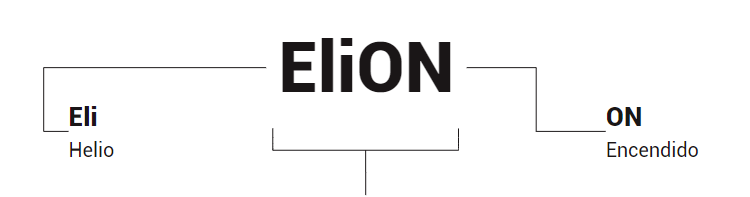
The prefix “Helio” directly relates to the sun. In fact, the element was named after it, as it was discovered by observing the sun.

In this wordplay, we capture the dynamic between power and energy (represented by “ON”) thanks to the strength of the sun (Eli-).

It’s easy to pronounce and clear in both English and Spanish.

  1. Branding

Similar to our name, this new visual direction for the brand has similar goals. We’re aiming for a simple image that reflects the technological, digital, and energy context we work in.

The proposals we’ll look at align with this vision and share these key features worth mentioning:

  1. Basic, clear, and simple typography with custom elements, using only lowercase letters to foster approachability and simplicity.
  2. Conceptual representations that align with the origin of our name.
  3. Graphic elements are integrated within the typography to broaden the visual landscape.

This combination mark proposal consists of a symbolic part and a text part.

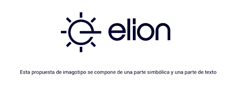
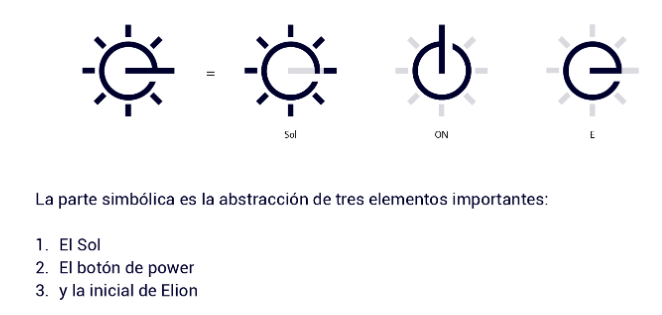
The symbolic part is an abstraction of three important elements:

  1. The sun
  2. The “power” symbol
  3. The initial of Elion

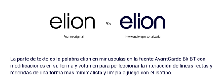
The text part features the word “Elion” in lowercase using the AvantGarde Bk BT font, with modifications to its shape and volume to enhance the interaction between straight and rounded lines, creating a more minimalist and clean look that complements the symbol.

}

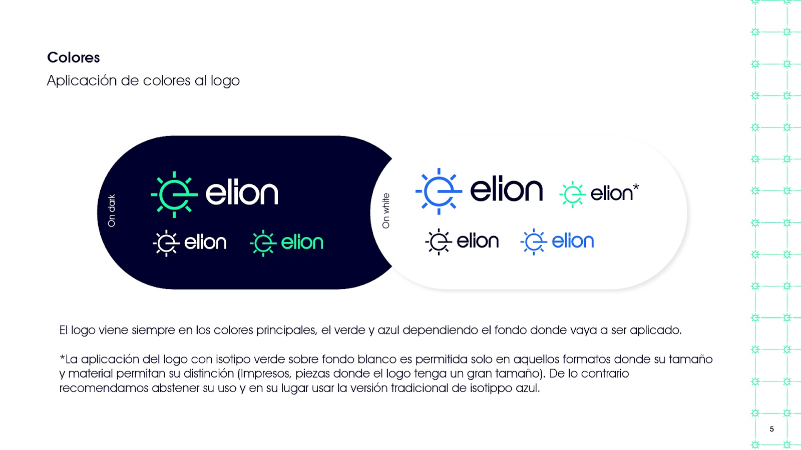
The logo is always presented in its primary colors, green and blue, depending on the background it will be applied to.

The application of the green symbol on a white background is permitted only in formats where its size and material allow for clear distinction (such as printed materials or instances where the logo is large). Otherwise, we recommend avoiding this use and instead opting for the traditional blue symbol version.

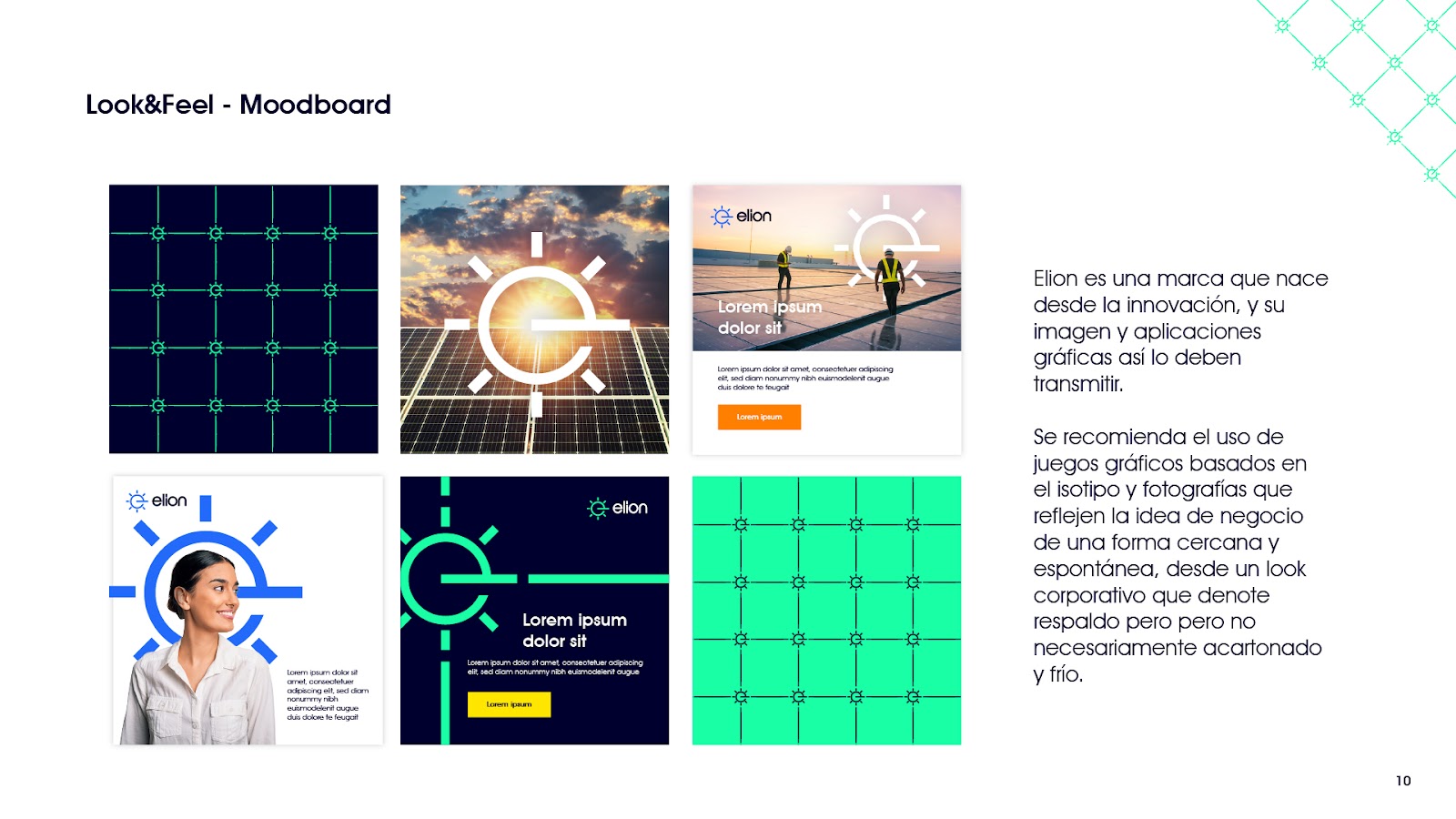
Elion is a brand that emerges from innovation, and its image and graphic applications should reflect this.

We recommend using graphic elements based on the symbol and photographs that convey the business idea in a relatable and spontaneous way, maintaining a corporate look that denotes professionalism without being overly stiff or gray.

Histórias de sucesso

caso exito multimoney
Multimoney | How financial products relate to SEO?
Traditional banks are up against a new competitor gaining serious traction in recent years: tech-driven financial service companies. While these “neobanks” offer major perks focused on saving...
Columbia | Exponential growth through Meta and Google Ads
Goal To achieve the monthly sales targets established by the client while keeping a stable investment budget. Solution We planned and executed funnels aimed at acquiring online...
Plat Legal | Landing Page Creation
Case Building a landing page to offer free trials for a digital service is a key strategy for turning visitors into potential leads and, ultimately, customers. This...
unica
ÚNICA | Landing Pages Creation
Case Some projects at Sí Señor Agencia involve multiple areas. This was true for the project we completed for the Instituto Universitario Colombo Americano (ÚNICA), which needed...
nexgard
Nexgard Colombia | Wow Paws
Client NexGard Colombia Campaign Wow Paws Case This strategy focuses on celebrating Father’s Day by highlighting those who take their role as responsible pet parents seriously. Even...
Nexgard
Nexgard Colombia | The Parasite Hunters
Client NexGard Colombia Campaign The Parasite Hunters Case In October, Colombia and the rest of the world celebrate Halloween, making it a major event. The film industry...

SIM SENHOR CLIENTES

Conheça algumas das marcas que trabalharam conosco e conheça algumas das marcas que trabalharam com a “Yes Sir Agency” e os resultados que elas alcançaram graças à implementação de nossas estratégias de Growth Marketing para atingir seus objetivos.

Clients:
Filter Categorías Clientes

Assine nossa newsletter

Olá! Se você gosta de coisas bonitas e quer se manter atualizado sobre as últimas notícias da Martech, visite nosso site e assine nosso boletim informativo.

Notícias
data analysis tools
5 Essential Tools for Data Analysis
Data analysis isn’t just a nice-to-have anymore—it’s a must. Companies of all sizes are tapping into the power of data to make smarter decisions and...
personal branding
Why is personal branding important?
If you’re active on social media and like sharing your thoughts on different topics, you already have a personal brand. In today’s hyperconnected world, your...
Why Should Companies Invest in Marketing Training
Why Should Companies Invest in Marketing Training?
Behind every successful business lies a digital marketing strategy that has helped it achieve its goals. Take Netflix, for example: its unique tone of voice...
persuation
The 5 Cs of Persuasion, Congruence Theory, and Credibility (Ethos), Logic (Logos), and Emotion (Pathos)
The concept of the “5 Cs of Persuasion” does not come from a single original source but is an evolution of various models and theories...
Scroll to Top
Find what you need with Yes Sir
Mesa de trabajo 1sisr
Search:
Mesa de trabajo 1sisr
Search: