Case
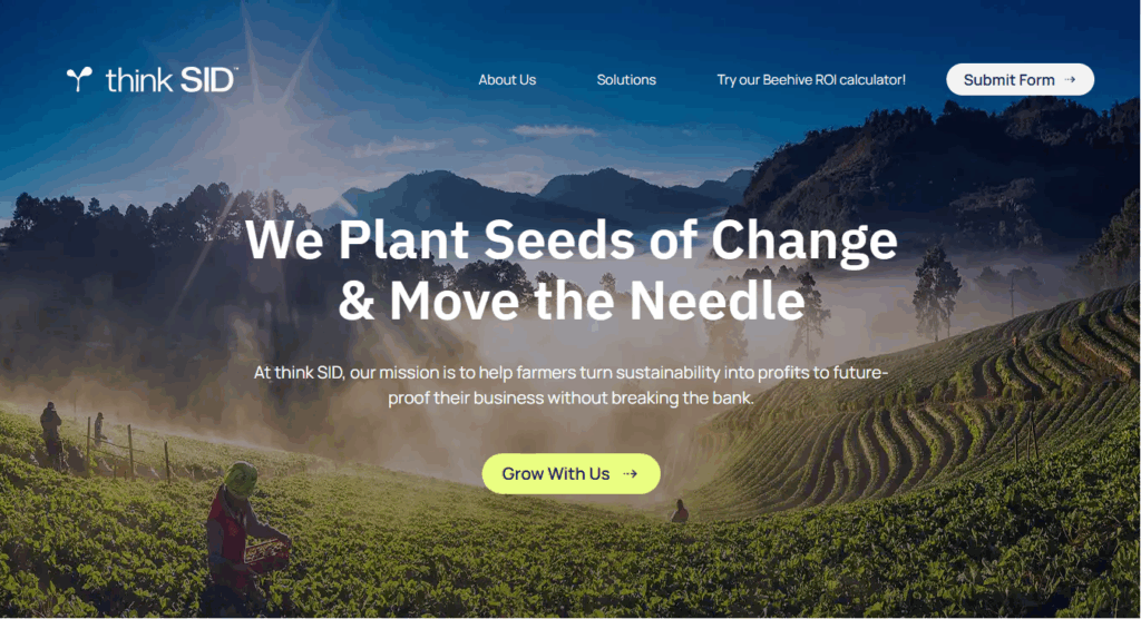
thinkSID specializes in solving business challenges through sustainability-driven solutions. For the development of their first one-page site, they partnered with Yes Sir, aiming to create a site that reflected the essence of their brand while also serving as a digital asset that offered a clear and accessible browsing experience.
| It’s important to distinguish a one-page website from a landing page. The first gathers all information and functionalities into a single page or screen, organized into navigable sections through scrolling or internal anchors. A landing page, on the other hand, although also a single screen, responds to specific and temporary objectives; it is usually shorter, more direct, and with less scroll length. |
Goals
- Align design and development with brand guidelines, respecting typography, color palette, and visual standards.
- Build a scalable MVP prepared to evolve over time.
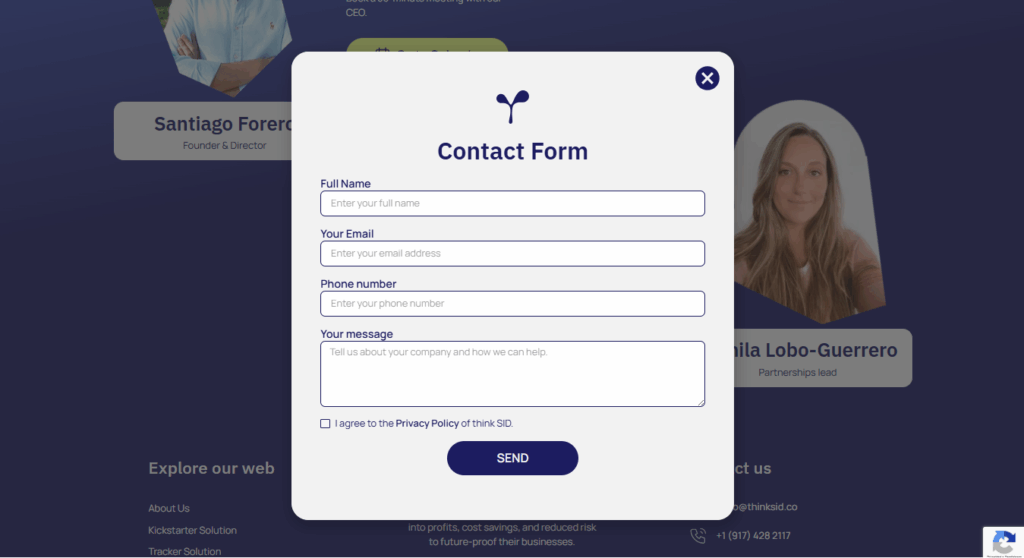
- Integrate CTAs with contact channels such as Calendly and forms as key conversion points.
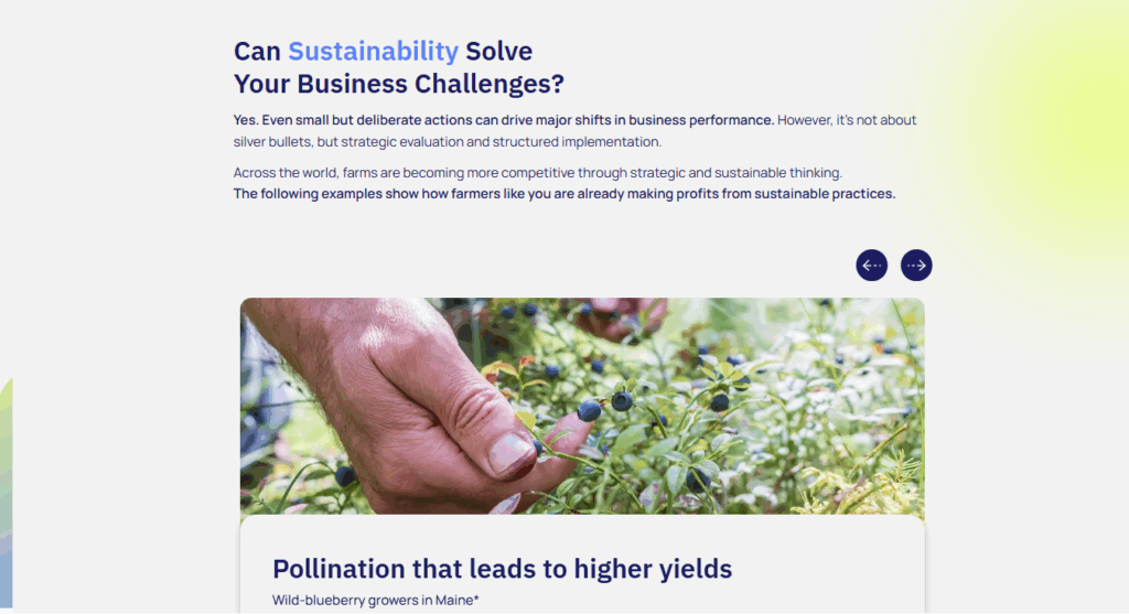
- Create dynamism across sections through imagery and visually engaging resources.
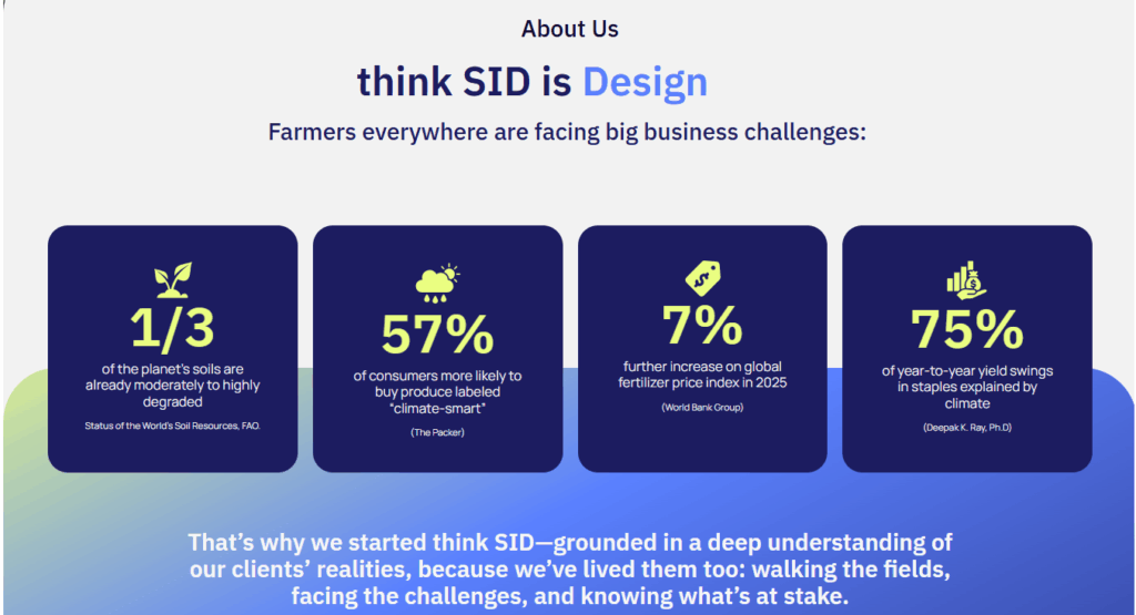
- Clearly communicate what the brand does and highlight its impact with concrete examples and results.
Execution
The project was developed based on thinkSID’s brand guidelines and centered on solution-oriented, inspirational content. The result was a modular one-page conceived as a scalable MVP, designed to evolve in the future and transform into a website with greater depth and additional sections while maintaining consistency.
Actions Taken
Stage 1:
In the first phase, we focused on exploring and understanding the client: we held direct conversations to identify which elements they valued, which didn’t work, and how they wanted to project their digital identity.
This process included a detailed analysis of their brand manual and understanding of their services, which allowed us to establish a solid foundation for copy and design.
Stage 2:
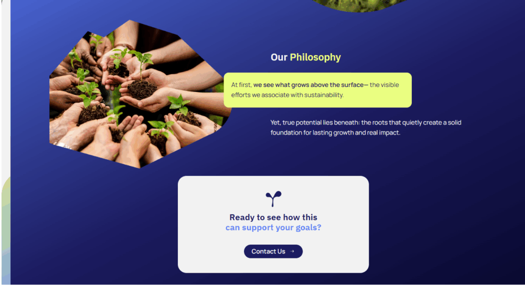
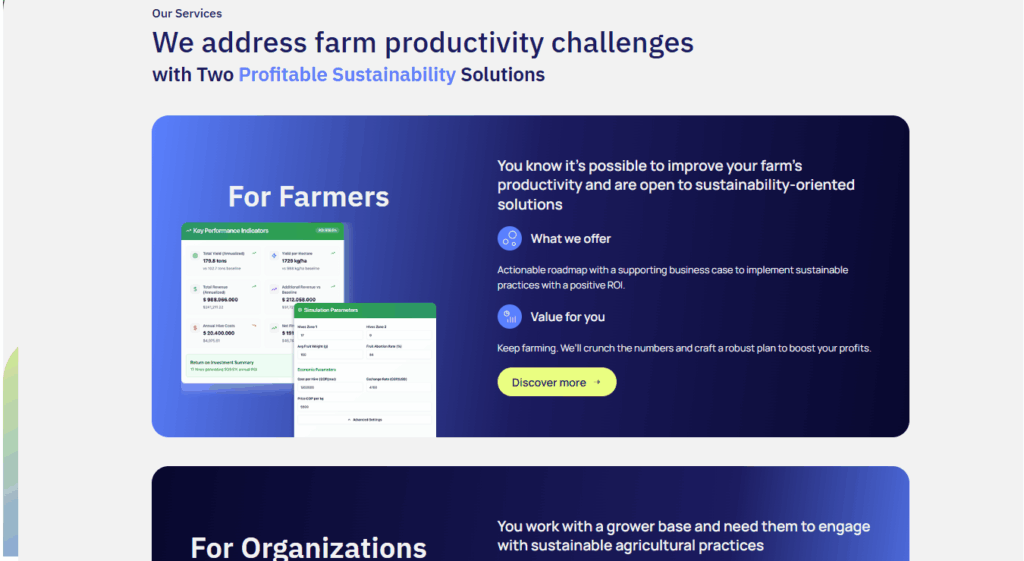
With the guidelines already defined and understanding that it was a one-page document, we designed clear sections that replaced the typical internal areas such as About Us, Contact, Success Stories, or Testimonials. These were merged into a single narrative flow, always maintaining the brand’s inspiring and collaborative tone.
The result was a 10-scroll screen capable of presenting the requested information homogeneously and organically. In this manner, we ensured a clear, consistent, and attractive user experience while remaining aligned with the project’s goals.
Stage 3:
Within clear parameters but with room for creativity, we developed on a small UI Kit, staying within a palette of nine colors and their tonal variations.
This chromatic framework sought to convey coherence without sacrificing freshness or dynamism. At the same time, we gave prominence to the call to action, ensuring that each user interaction was clearly and attractively guided toward conversion goals.
| The main challenge was to strike a balance between the large amount of information to be presented and the need to be disruptive in layout. To achieve this, we implemented modals and structures uncommon in traditional landing pages, seeking to capture attention without losing readability. The result was a powerful representation of both information and design, aligned with the expectations of the target audience and true to the brand’s spirit. |
Final Results
Discover the interactions and user-centered design approach at www.thinksid.co