Case
Siesa is one of the largest technology companies in Colombia. With a presence in three countries, it offers ERP software and electronic invoicing solutions for small, medium, and large businesses.
Recognizing the diversity of its audience, Siesa partnered with Yes Sir’s web team to redesign its site into a more human, clear, and easy-to-navigate platform—one built to meet the needs and search intent of every type of user.
Goals
- Design a more empathetic, people-centered interface.
- Position services according to user search intent.
- Unify the communication tone across all sections: approachable and empathetic, regardless of industry.
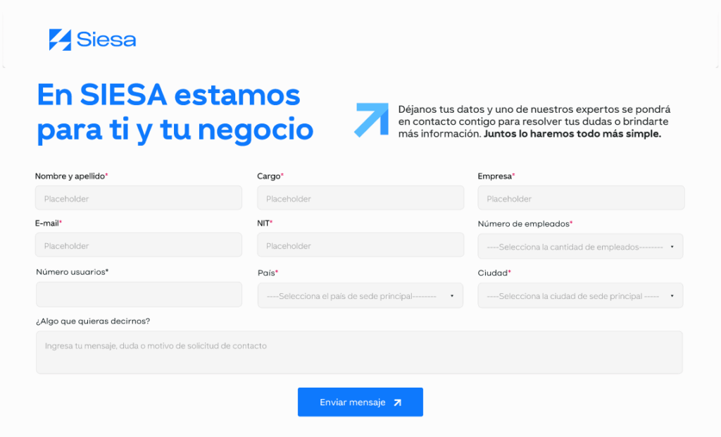
- Separate each service with specific forms to streamline conversions.
- Tell the brand’s story, highlight its values, and create an attractive platform for job applications.
Execution
We supported Siesa from a User Experience (UX) approach at every stage: from building content to designing simple, effective experiences.
These were some of the aspects we focused on:
UX Writing
- One of the project’s biggest challenges was content management. Translating highly technical product and service features into clear, accessible messaging—without losing value or overstating the promise—was essential. To achieve this, we worked closely with Siesa’s team to ensure every piece of content was precise and approachable for different user profiles, while still carrying the depth required for enterprise-level solutions.
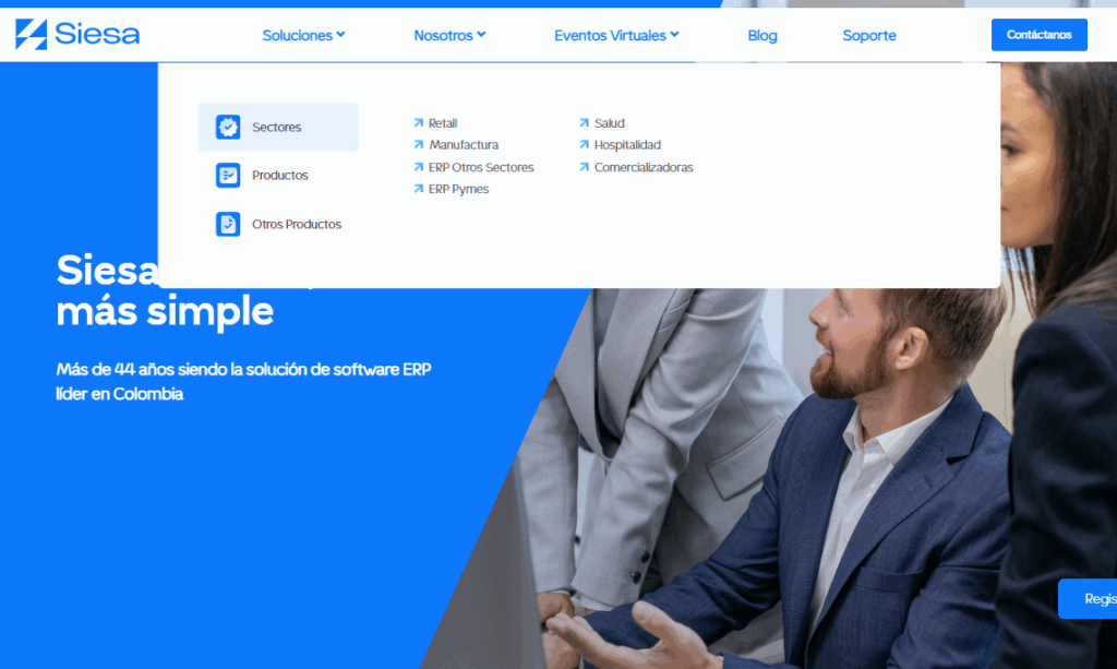
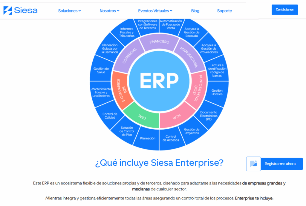
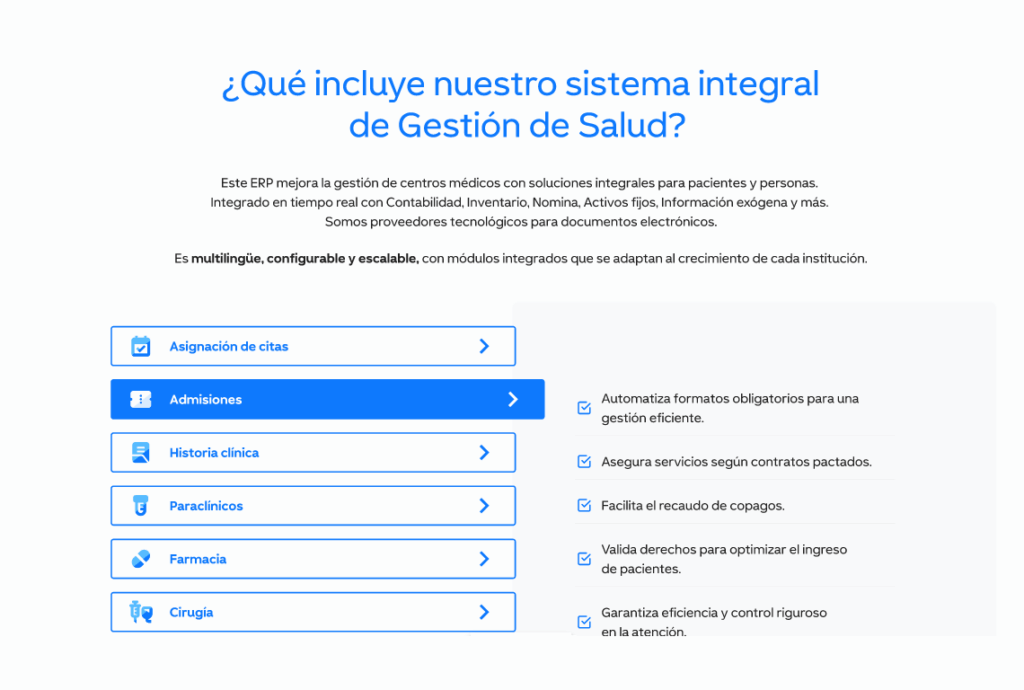
- Since the topics involved technical areas such as ERP, electronic invoicing, and business automation, we opted for visual resources to facilitate comprehension. To avoid dense text blocks, we incorporated dynamic elements such as modals, tabs, and toggle states, allowing information to be layered and guiding users according to their interests or knowledge level.
- It was also essential to highlight Siesa’s trajectory: over four decades leading the technology sector in LATAM. That’s why, on every service page, we ensured the brand’s history, experience, and benefits were strategically presented, without falling into repetition or overload.
- Content had a strong SEO focus. Keyword research was fundamental to connect with users looking for everything from basic information to comparisons or purchase decisions about solutions like electronic invoicing or ERP software.
UX/UI Design
- Just like with UX Writing, managing the amount of information was also a challenge in UX/UI design. It was crucial to organize content blocks in a way that was visually appealing, easy to understand, and simple to navigate, without overwhelming the user or losing clarity.
- Color use was another consideration. While blue and white are Siesa’s primary brand colors, relying solely on them risked creating a monotonous interface. To strike a balance, we introduced secondary colors in a subtle way, complementing the brand palette while maintaining visual consistency and creating a more engaging experience.
- CTA placement and clarity were also crucial. Each call-to-action was carefully designed to guide navigation intuitively, ensuring users always knew their next step.
- Although the brand guidelines were respected, new web applications were proposed, such as the use of illustrations, to make the experience more human, approachable, and modern.
- Striking the right balance between the client’s expectations and our team’s proposals was essential. Transitioning from traditional graphic design to a user-centered digital experience required constant dialogue, exploration, and alignment to ensure the final product met both user needs and business goals.
| We can say that… This project gave us the opportunity to transform complex, highly technical information into a digital experience that is clear, functional, and fully aligned with Siesa’s leadership in the Latin American market.. Every decision, from content structure to visual design, was aimed at makinginformation easier to understand, improving navigation, boosting conversion,and strengthening the positioning of a brand with history, vision, andcredibility. |
Final Results
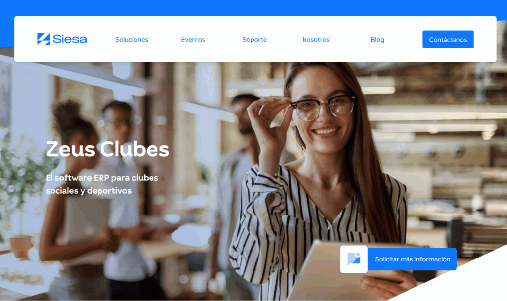
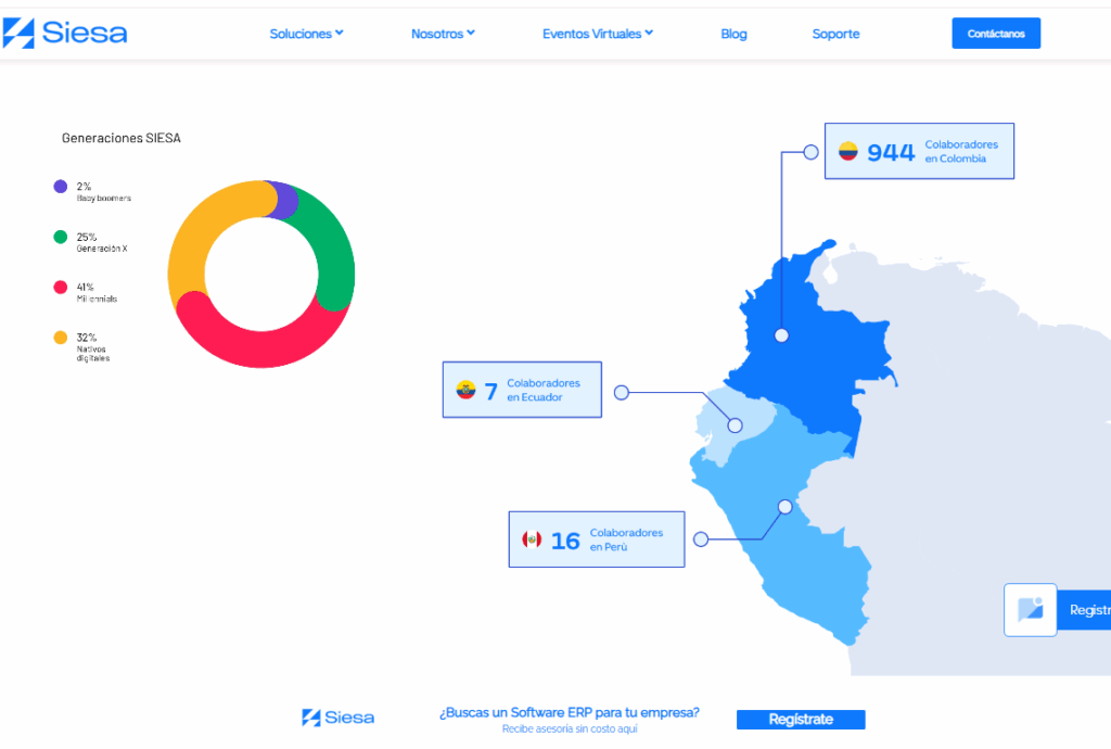
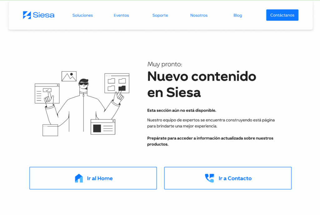
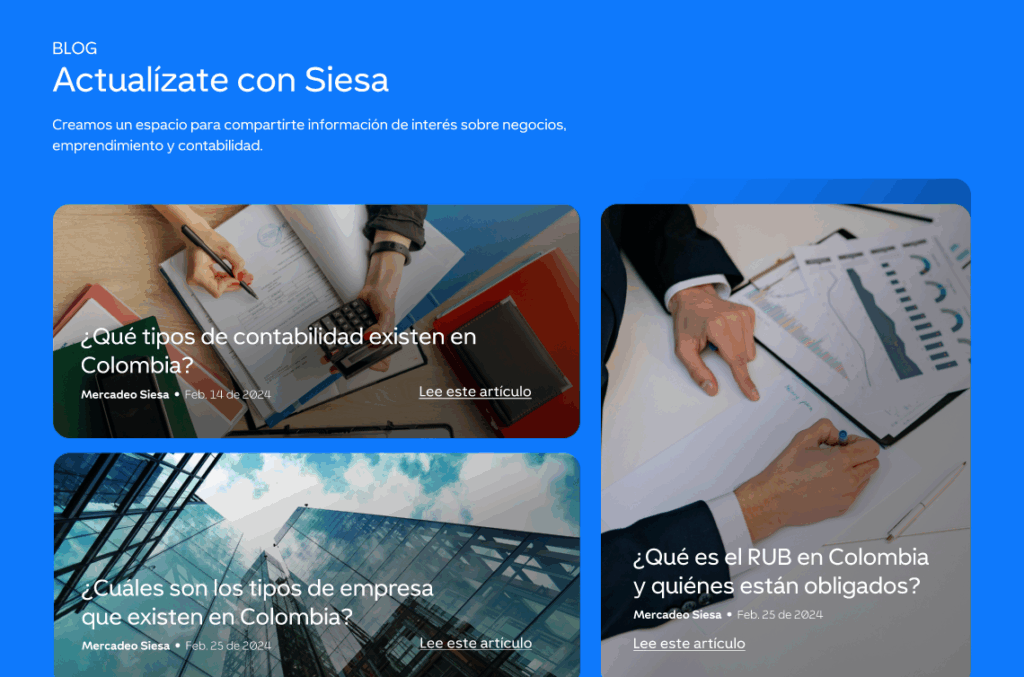
Here are some of the screens developed for Siesa, showcasing an efficient digital experience fully aligned with the brand’s identity and reputation.