Case
Odaptos is an innovative platform that blends usability testing with artificial intelligence to analyze users’ emotions as they interact with digital products. Its technology identifies facial expressions, voice tones, and behaviors to deliver precise insights into the user experience.
In 2025, Odaptos partnered with Yes Sir, and since then we’ve worked together across multiple areas, including expert spokesperson strategy, paid media, and automation. In this case study, we’ll focus on the web strategy—a collaboration that has strengthened Odaptos’ digital presence and optimized its browsing experience.
Goals
- Create three landing pages tailored to different search intents and user journeys.
- Generate conversions by encouraging users to sign up and try the platform.
- Ensure full alignment with brand guidelines, including typography, color palette, and visual identity.
- Clearly communicate what the brand does while showcasing its impact and value engagingly and distinctively.
| Why use three landing pages within one campaign? Using three different versions goes beyond a simple A/B test. It allows us to experiment with diverse audiences, messages, themes, and keywords to identify which approach drives the best results. This strategy helps optimize resources, expand reach, and unlock new opportunities for conversion and visibility. |
Execution
We developed this project based on Odaptos’ brand guidelines and solution-driven, inspiring content. The result was a modular one-page MVP designed to scale and evolve into a deeper, more structured website without losing coherence or consistency.
Actions Taken
SEO: We conducted in-depth keyword research focused on three key areas: user AI, customer experience, and emotional design.
This allowed us to uncover high-potential keywords and relevant trends, which became the foundation for the content and structure of each landing page—boosting organic positioning and interest-based segmentation.
UX Writing: We created three unique copy versions, each tailored to a specific objective, audience, and main keyword.
The goal was to maintain a consistent, user-friendly communication style that delivered a clear and engaging experience. We also avoided SEO cannibalization and content repetition, ensuring each page brought distinct value to the campaign.
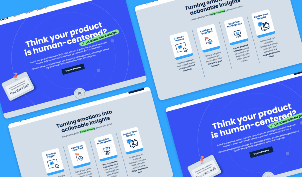
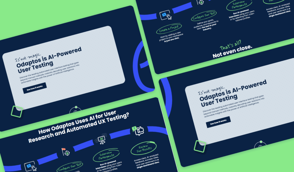
UX UI: We designed three landing pages with different visual approaches, yet all aligned with the same brand identity.
Their modular structure allows components to be reused in different contexts while maintaining visual and functional consistency. This approach provided aesthetic variety and content flexibility, ensuring a unified and attractive user experience.
Web Engineering: We developed three landing pages with specific functionalities tailored to each goal.
Common elements such as the menu, CTAs, and footer remained consistent and linked back to the main site. What set each version apart was the use of dynamic components, transitions, and microinteractions, creating a smooth and cohesive browsing experience across all pages.
Final Results
Three distinct landing pages, one visual identity? We created a coherent, unified experience—maintaining consistency in design, tone, and structure throughout the entire journey.
Landing 1:
https://odaptos.com/ai-user-testing/
Landing 2:
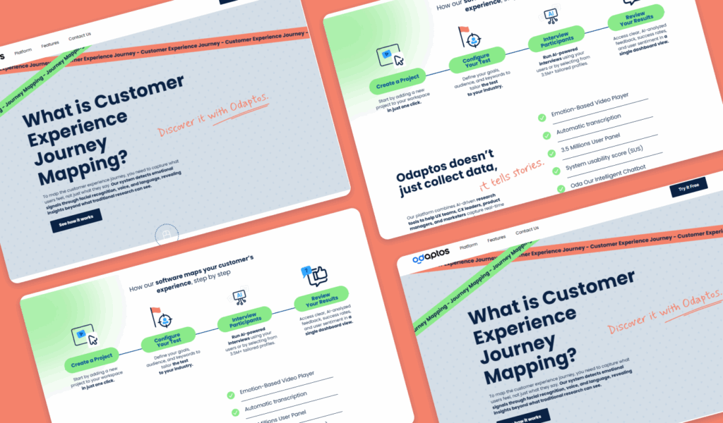
http://odaptos.com/customer-experience-journey-mapping
Landing 3 :