Challenge
Manager Hero is our first rebranding project, prompted by the lack of visual identity, conceptual depth, and personality in the original AI-generated logo. Our challenge was creating a new brand image that truly reflects its purpose and personality.
Solution
Manager Hero represents individuals with high leadership potential in the corporate world as heroes. However, this isn’t the typical hero, but rather an everyday one who overcomes challenges with discipline, courage, and determination, rather than relying on supernatural powers or innate talent.
We worked with the client’s input, incorporating elements of 80s nostalgia and cyberpunk aesthetics.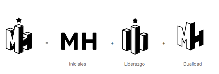
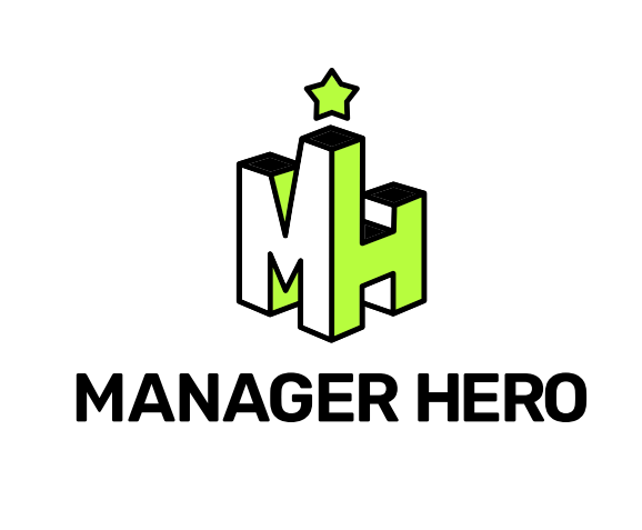
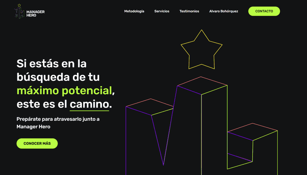
This proposal blends nostalgia with tradition, featuring a monogram of the initials “M” and “H” as the isotype. Conceptually, the isotype represents leadership and competitiveness, forming a podium where the star at the top embodies the idealization of personal goals. The 3D isometric perspective adds unity and compactness while symbolizing the dual role of the manager and the hero.
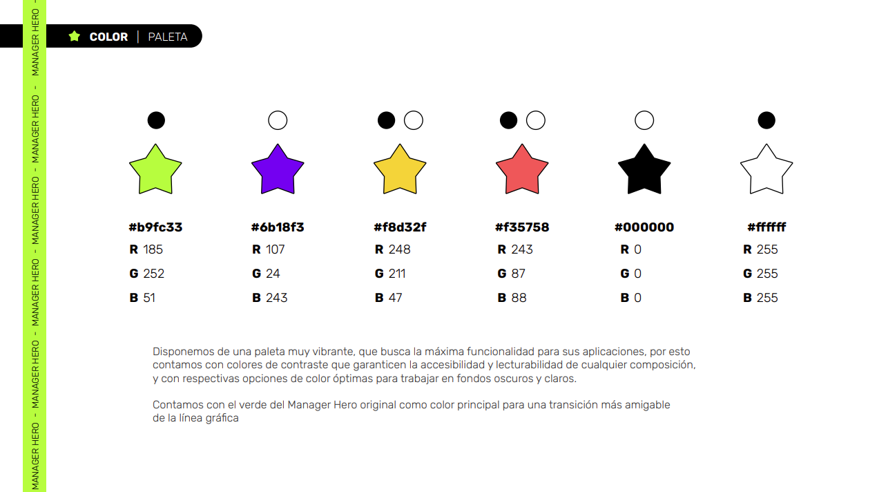
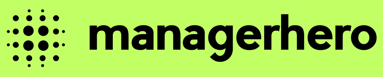
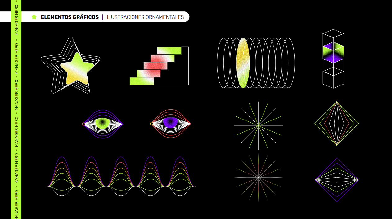
We’ve developed a vibrant color palette focused on maximizing functionality across various applications. It features contrasting colors that guarantee accessibility and readability in any design, with optimal color options for both dark and light backgrounds.
We’ve kept the original Manager Hero green as the main color to facilitate a smooth transition in the brand’s visual identity.
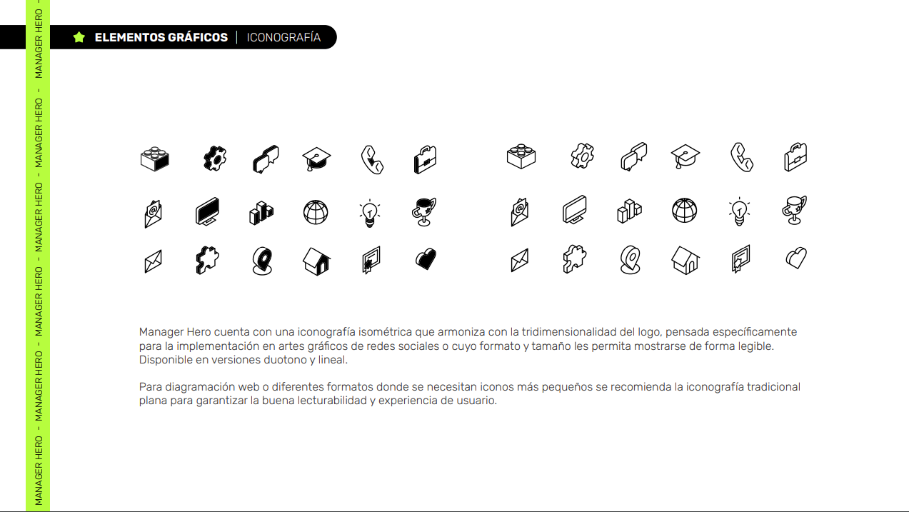
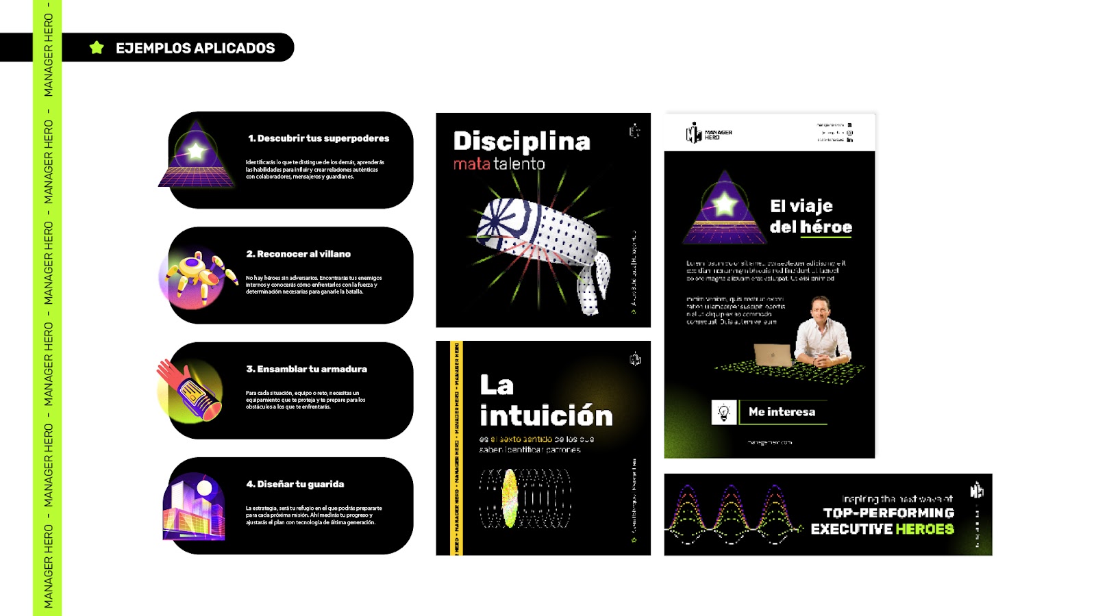
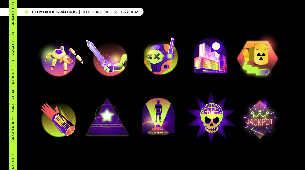
Manager Hero incorporates isometric iconography that aligns with the logo’s three-dimensional style, specifically designed for use in social media graphics or formats where its size and detail can be displayed clearly.
The iconography comes in both duotone and line variations.
For web layouts or other formats requiring smaller icons, we recommend using traditional flat iconography to ensure optimal readability and user experience.
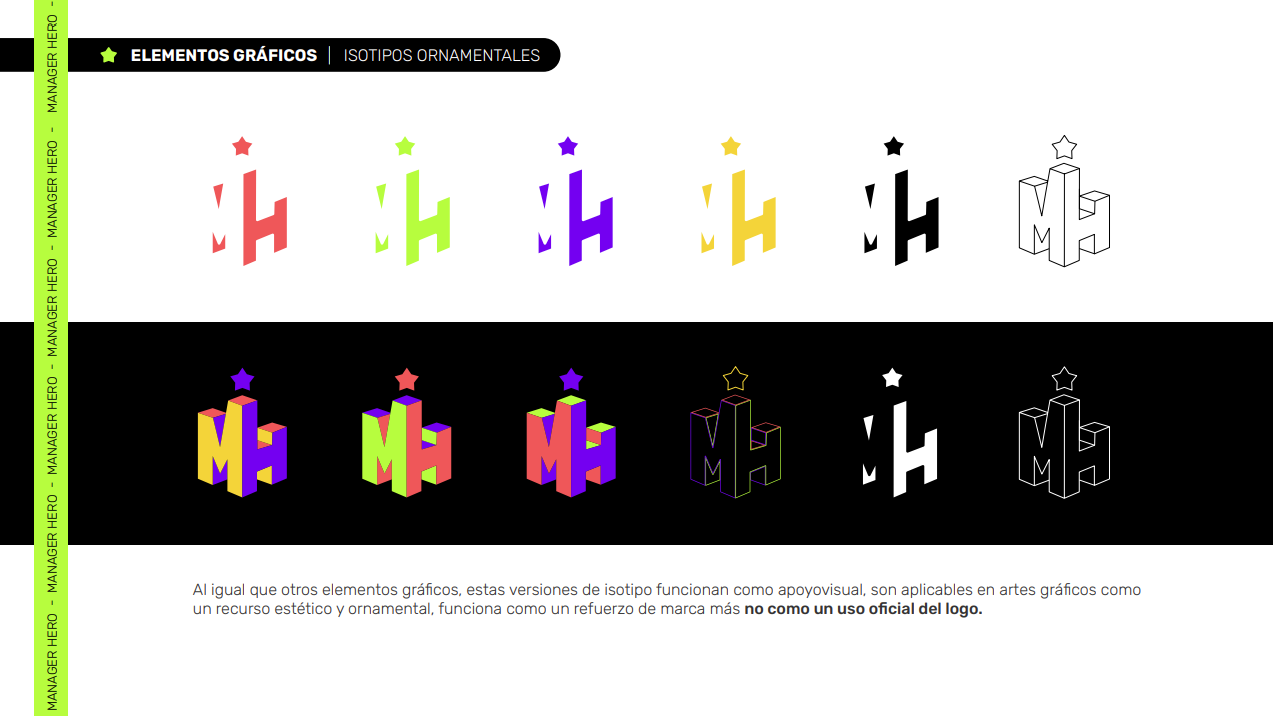
Just like other graphic elements, these variations of the isotype function as visual aids. They can be used in graphic designs as aesthetic and decorative elements, serving as brand reinforcement rather than being used as the official logo.