Case
This year at Yes Sir, we had the opportunity to work with Odaptos through our web development area. First, we developed three landing pages focused on paid campaigns and aligned with users’ search intent (you can see that case here).
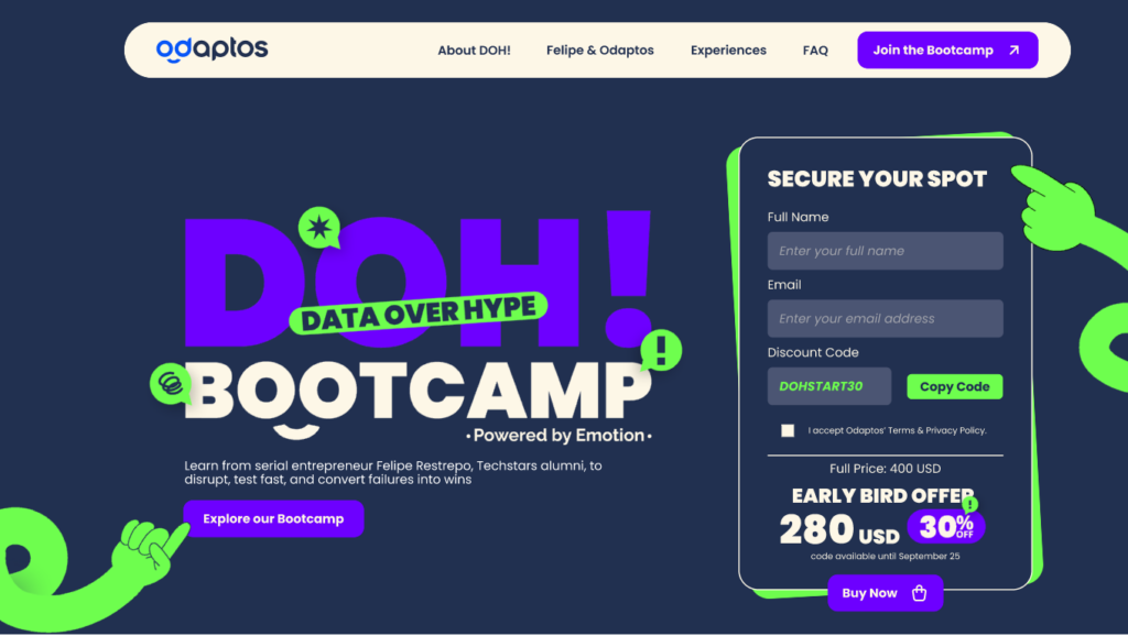
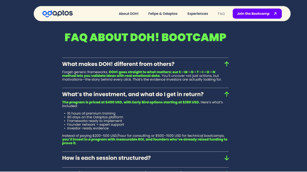
We also collaborated with this platform, which combines usability testing with artificial intelligence to analyze users’ emotions as they interact with digital products, to create a landing page centered on their new program: the Doh! Bootcamp.
Goals
- Position the Data Over Hype Bootcamp in front of its target audience.
- Align the landing page with the brand guidelines: typography, colors, and visual standards.
- Present the program’s benefits and differentiators clearly and attractively.
- Strengthen credibility through their CEO, press coverage, testimonials, success stories, and verifiable metrics.
- Integrate microinteractions that optimize the enrollment flow with clear and strategic CTAs.
Execution
To bring this landing page to life, we worked collaboratively across UX Writing, SEO, UX/UI Design, and Web Development. We created an experience optimized to convert visitors into leads, adapting to each pricing stage to enhance the navigation experience.
Actions Completed:
Positioning the Data Over Hype Bootcamp:
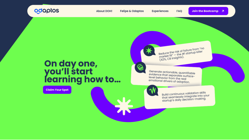
This meant creating a landing page capable of motivating CEOs and founders to sign up. The goal was to showcase why this program is essential for identifying, validating, and solving hidden emotional barriers in their markets using evidence-based methodologies and Odaptos’ advanced analysis.
To reinforce this approach, we worked on wording using terms like powered, exclusive, support, experience, unlock and level up, which convey innovation, growth, and strategic mastery. This language helped communicate a solid, aspirational, and results-oriented value proposition for leaders and product teams.
Aligning the landing with the brand guidelines:
Having already developed three previous landings, it was essential to avoid repetition. The goal was to create a page that remained consistent with Odaptos’ visual identity while still having its own personality.
To achieve this, we worked on wording, search intent, and design, integrating elements that unify all the landings without losing uniqueness. Icons, colors, and brand typography were respected, while giving this bootcamp its own attitude and aesthetic to stand out within the same digital ecosystem.
Presenting pricing, benefits, and differentiators:
This bootcamp had various purchasing stages, from Super Early Bird to full price, designed to encourage early registration and reinforce exclusivity. Therefore, the landing needed to clearly communicate the benefits, differentiators, and advantages of each phase, enabling users to understand the program’s real value before deciding.
Once the key information for conversion was presented, we carried out the technical work: implementing analytics tools, configuring event tracking for each funnel stage, and optimizing load speed to ensure a fast and reliable experience.
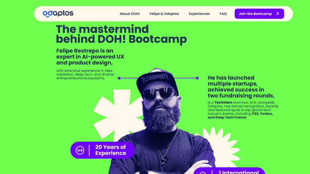
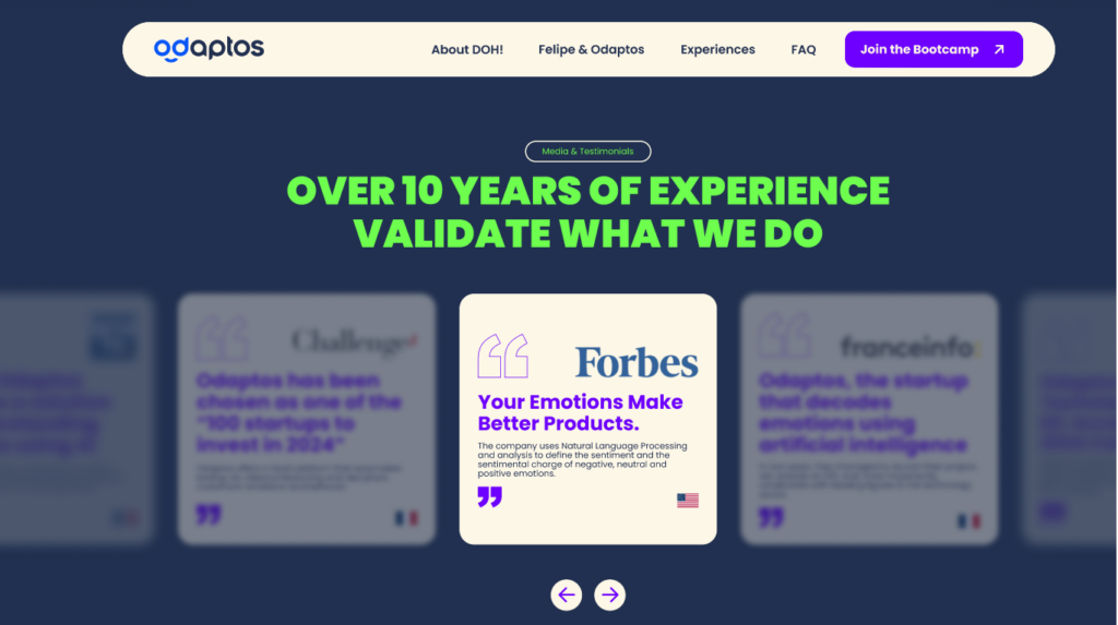
Strengthening credibility:
We incorporated strategic UX Writing and UX/UI elements to validate Odaptos’ value proposition among an audience unfamiliar with the brand. International media features, verifiable performance metrics, and trust badges were included to reduce uncertainty and reinforce legitimacy.
From a UX/UI design perspective, the information was organized into visually hierarchical blocks to improve readability. Combined with social proof components, these resources helped build user confidence, increase perceived authority, and strengthen conversion intent throughout the journey.
Integrating microinteractions:
This was defined from the landing page’s architecture to optimize the conversion flow, preserve navigation continuity, and increase clarity. Each section was designed with a specific, contextual, visually differentiated CTA, all leading to the same destination: the form and, subsequently, the payment gateway.
This logic built a coherent and predictable journey, reducing friction and making it easier for users to take action without excessive scrolling. Microinteractions reinforce perceived control, guide users through every step of the journey, and add dynamism without compromising usability.
Final Results
Explore the bootcamp and the work carried out by Yes Sir’s Web Engineering team in detail here: https://landing-page.odaptos.com/bootcamp-product-market-fit/